Chapter 2: Frequency Distribution and Graphs
Organizing Data
Raw Data
Raw Data: Unprocessed data
Example: Study of colors of cars in a lot; the raw data is the list of colors
| red |
|---|
| blue |
| blue |
| white |
| black |
| blue |
| white |
| red |
| orange |
| white |
For data to be useful, it must be organized.
Frequency Distribution
Frequency Distribution: Organizes raw data by showing the distribution of each class’s frequency
Class: Category data is placed in
Frequency: Number of times data within a class appears in a dataset
Example: The above car-color data can be placed in the following frequency distribution:
| Class | Frequency |
|---|---|
| red | 2 |
| blue | 3 |
| white | 3 |
| black | 1 |
| orange | 1 |
| TOTAL: | 10 |
Types of Frequency Distributions
-
Categorical Frequency Distribution: Places data in individual qualitative classes
Example: Car color
-
Grouped Frequency Distribution: Places data in grouped classes; generally ranges of values for quantitative data
Example: Ages of students in a class
Raw data:
22 31 29 29 27 21 24 18 21 33 Grouped Frequency Distribution:
Class Frequency 18-21 3 22-25 2 26-29 3 30-33 2 TOTAL 10 -
Ungrouped Frequency Distribution: Used for a small range of quantitative values; instead grouping values into classes, each is its own class
Example: Age of students in a class
Raw data:
22 21 19 19 18 21 20 18 21 20 Ungrouped Frequency Distribution:
Class Frequency 18 2 19 2 20 2 21 3 22 1 TOTAL: 10
Class Details
Class Limits: Range of values included in class
- Lower Class Limit: Lowest value included in class
-
Upper Class Limit: Highest value included in class
Example: “18-21”
- “18-21” is the class limit
- “18” is the lower class limit
- “21” is the upper class limit
Class Boundaries: Specifies the range of values which are rounded to the class; fills the gap between a class’s upper limit and the lower limit of the next class
Example: Distance, in miles
| Class Limits | Class Boundaries | Frequency |
|---|---|---|
| 3-5 | 2.5-5.5 | 3 |
| 6-8 | 5.5-8.5 | 6 |
| 9-11 | 8.5-11.5 | 2 |
| 12-14 | 11.5-14.5 | 5 |
- Unlike class limits, where the upper class limit of a class is one less than the lower class limit of the next, the upper class boundary of a class is equal to the lower class boundary of the next
- Class limits should contain the same number of decimals as the data; class boundaries should contain one more, and generally end in a 5
- Class boundaries should be halfway between the lower class’s upper limit and the higher class’s lower limit
Class Width: Width of class range
- To calculate, subtract a class’s lower limit from the next class’s lower limit
- Alternatively, subtract a class’s lower boundary from the class’s upper boundary
- Note: Do not subtract a class’s lower limit from the class’s upper limit
Class Midpoint ($X_m$): Midpoint of class range
-
To calculate, find the average of the class limits, or the class boundaries
Example:
- Class: “3-5”
- Class Midpoint: “4”
Creating Grouped Frequency Distributions
Guidelines:
- Classes should be mutually exclusive
- Classes should be continuous
- Classes should include all the data
- Classes should be of equal length
- Other than first or last open-ended class in an open ended distribution
Procedure:
- Find the lowest and highest data values.
- Find the range of values by subtracting the lowest value from the highest.
-
Divide the value range by the desired number of classes.
Note: There are numerous algorithms for finding the optimal number of classes for a data set.
- If the result is not a whole number, round up.
- This is the class width.
- The first class’s lower limit is the lowest value.
- The second class’s lower limit is the first class’s lower limit plus the class width.
-
The first class’s upper limit is the second class’s lower limit minus one.
Example:
Raw data:
22 31 29 29 27 21 24 18 21 33 - Lowest value: 18. Highest value: 33.
- Range of values: 15
- Desired number of classes: 4.
- $\lceil \frac {15} {4} \rceil$ = 4
- Class width: 4
- First class lower limit: 18
- Second class lower limit: 22
- First class upper limit: 21
Cumulative Frequency Distribution
Cumulative Frequency Distribution: Shows frequency of all values ≤ a certain value; generally a class’s upper boundary
Example:
| Class Limits | Class Boundaries | Frequency | Cumulative Frequency |
|---|---|---|---|
| 3-5 | 2.5-5.5 | 3 | 3 |
| 6-8 | 5.5-8.5 | 6 | 9 |
| 9-11 | 8.5-11.5 | 2 | 11 |
| 12-14 | 11.5-14.5 | 5 | 16 |
Histograms, Frequency Polygons, and Ogives
Histogram
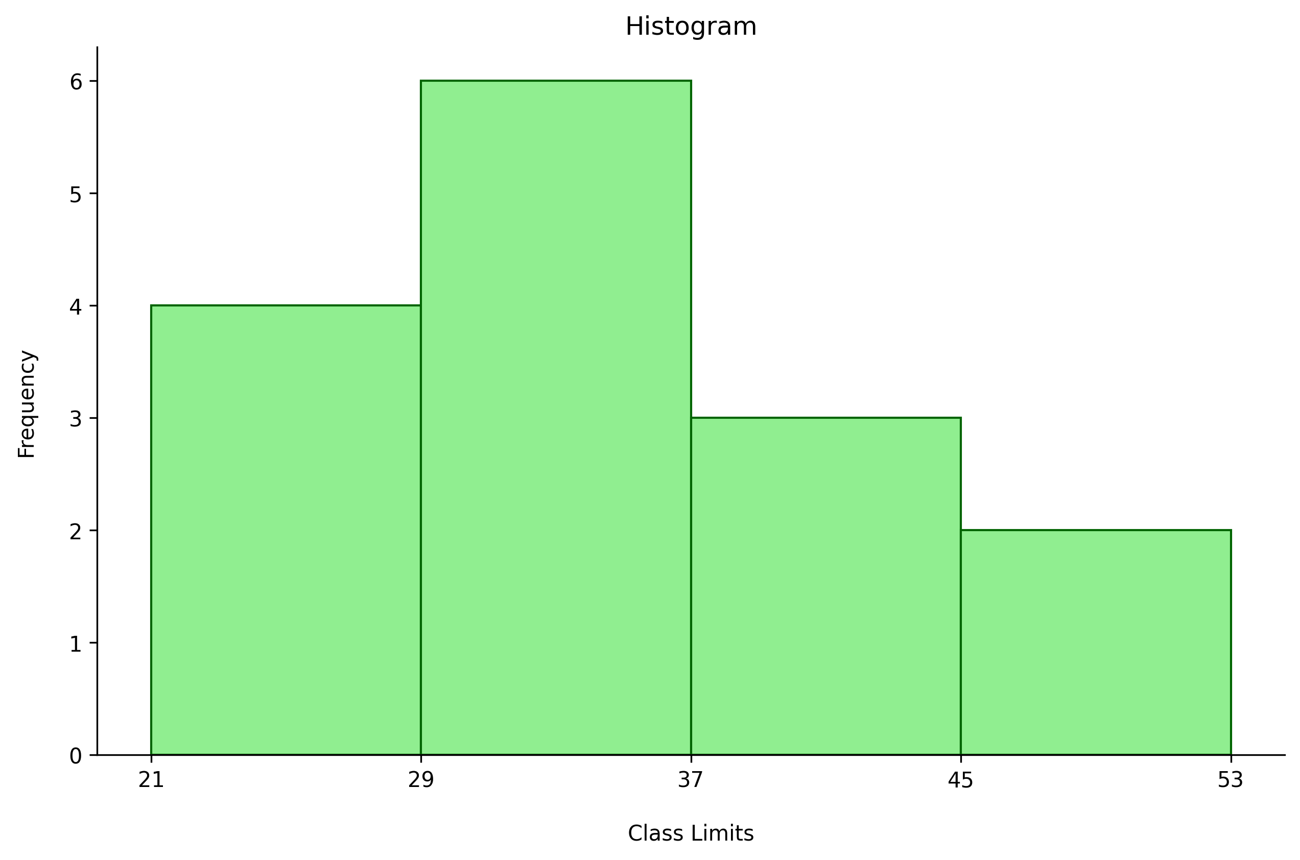
Histogram: Graphs a frequency distribution with continuous vertical bars
Example:
| 24 |
|---|
| 25 |
| 49 |
| 26 |
| 31 |
| 32 |
| 21 |
| 29 |
| 40 |
| 30 |
| 29 |
| 47 |
| 43 |
| 36 |
| 41 |
Frequency Distribution:
| 21-28 | 4 |
|---|---|
| 29-36 | 6 |
| 37-44 | 3 |
| 45-52 | 2 |
Histogram:
Frequency Polygon
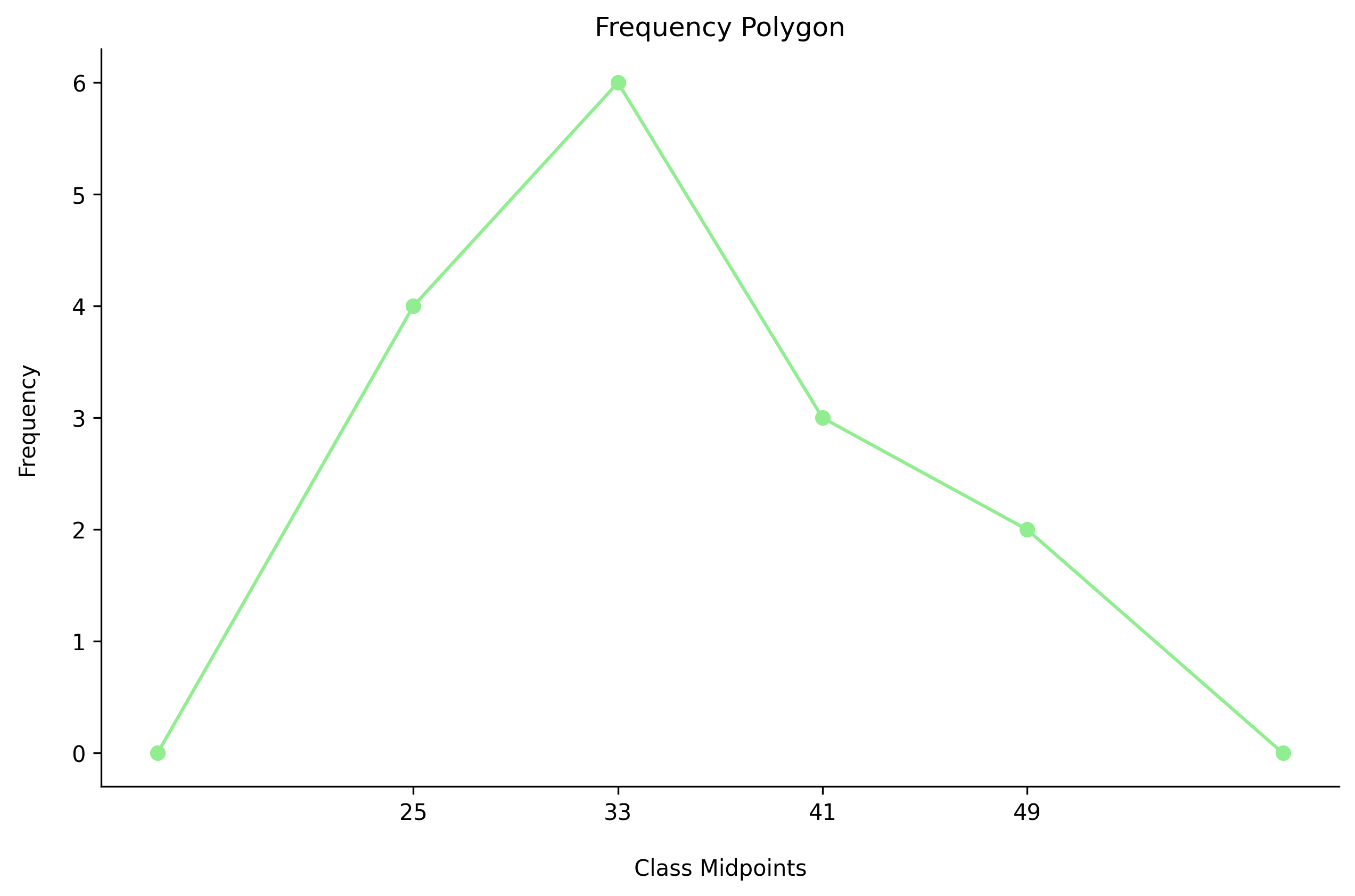
Frequency Polygon: Graphs a frequency distribution by plotting the class midpoint by the class frequency
Example:
Ogive
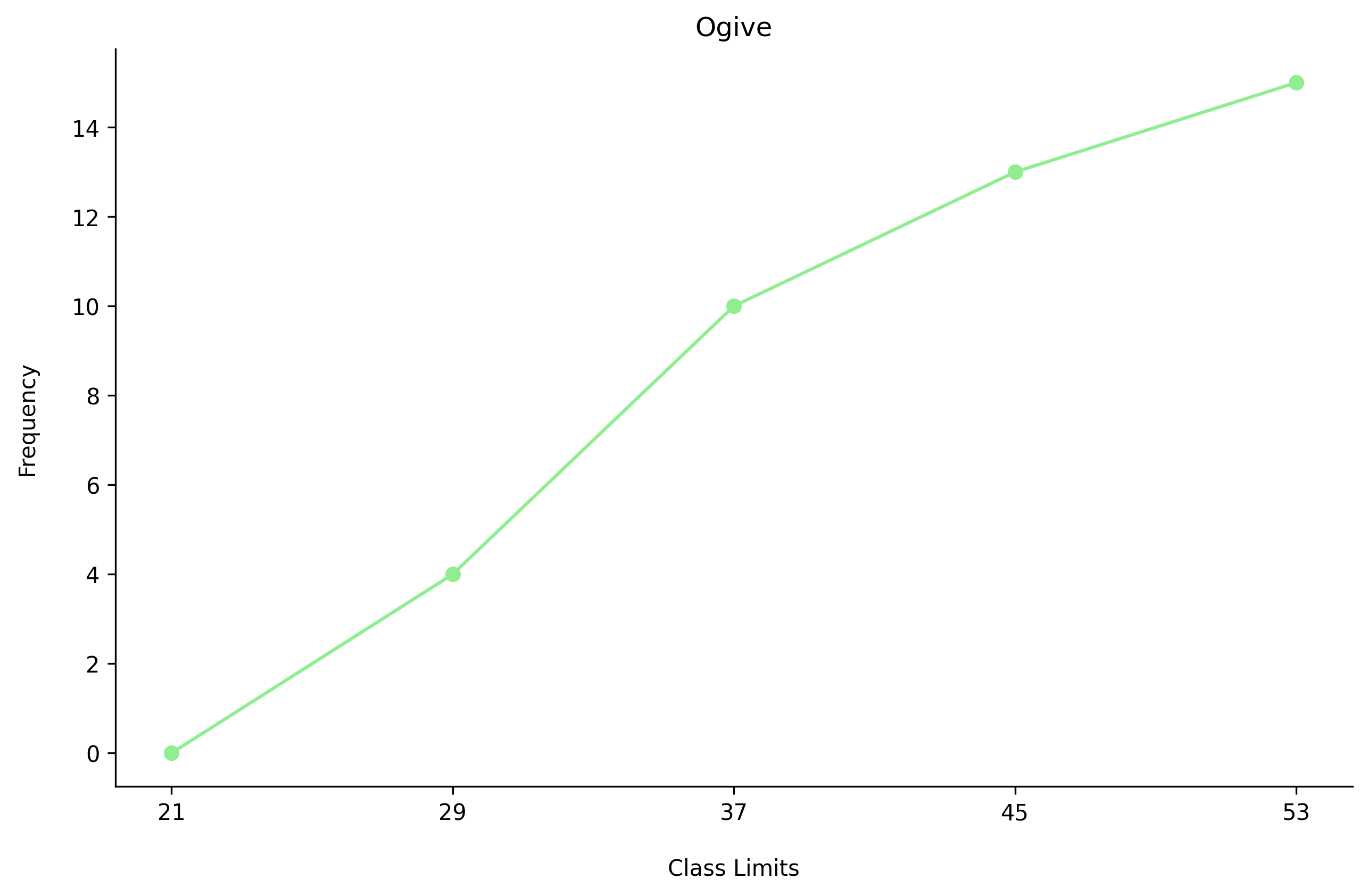
Ogive: Plots the cumulative frequency of values below the class upper boundaries
Example:
Relative Frequency
Relative Frequency: A class’s frequency as a percentage of the total number of values
Example:
| Class | Frequency | Relative Frequency |
|---|---|---|
| 21-28 | 4 | 0.267 |
| 29-36 | 6 | 0.4 |
| 37-44 | 3 | 0.2 |
| 45-52 | 2 | 0.133 |
Distribution Shapes
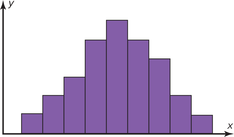
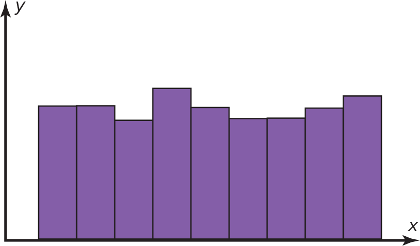
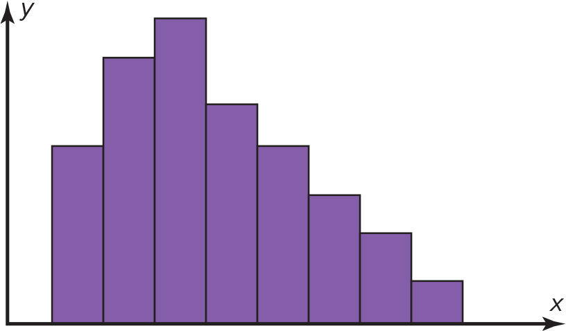
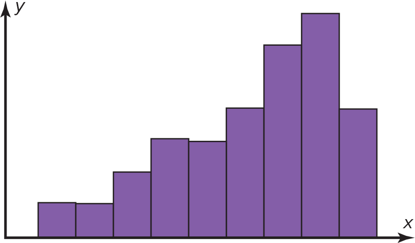
The shape of a frequency distribution graph can reveal information about the distribution.
-
Bell Shaped:
-
Uniform:
-
Right Skewed:
-
Left Skewed:
-
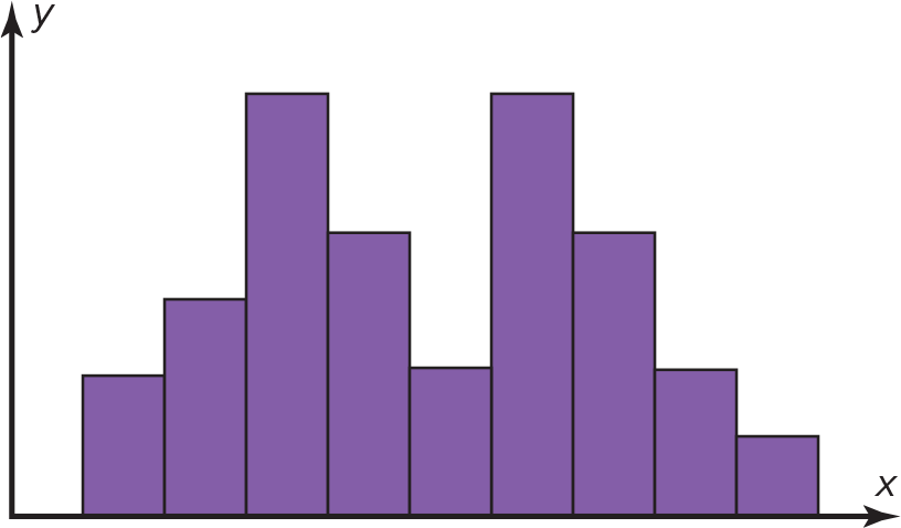
Bimodal - has two peaks:
Other Types of Graphs
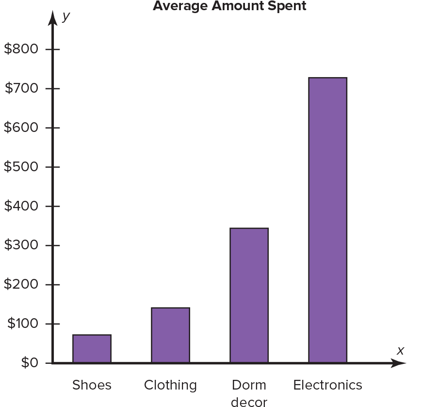
Bar Graph
Example:
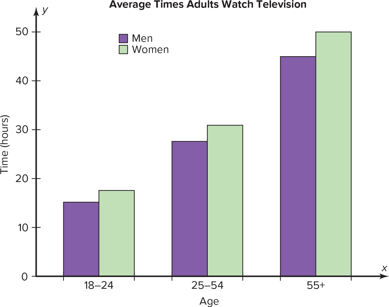
Compound Bar Graph: Compares data from two groups
Example:
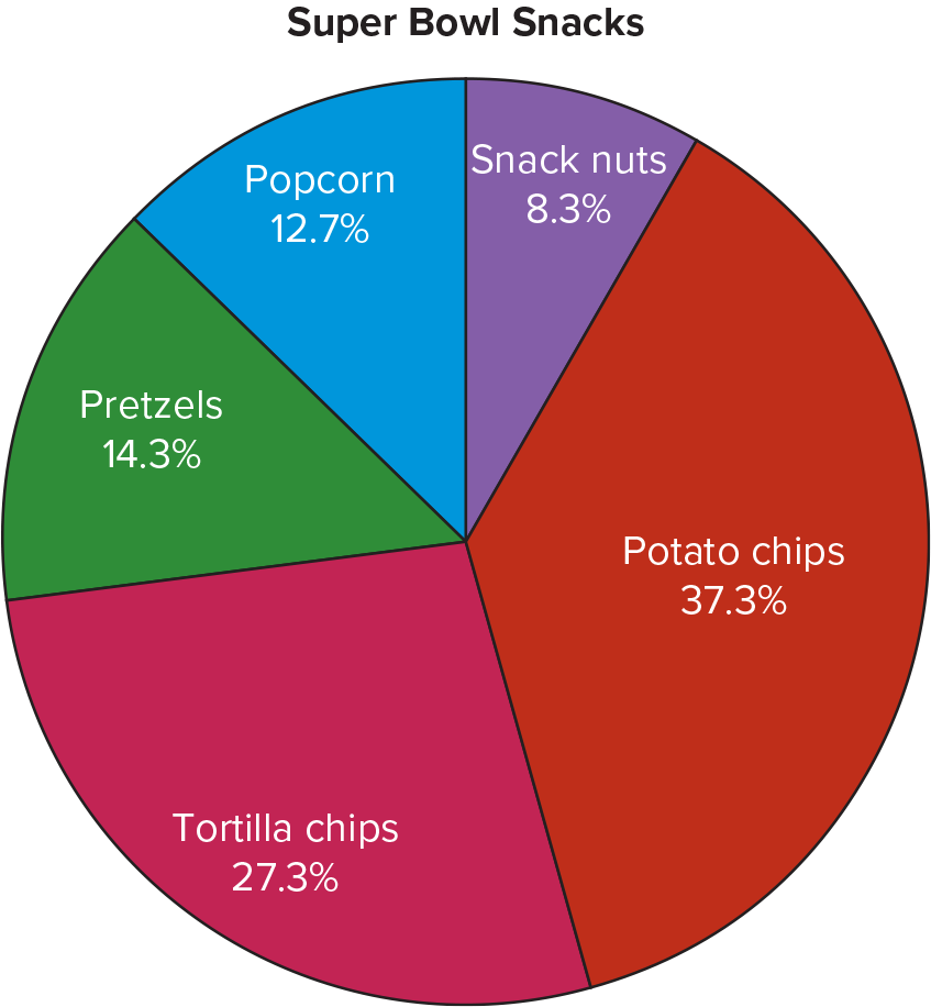
Pie Graph
Example:
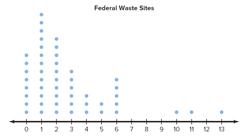
Dot Plot
Dot Plot: Plots a frequency distribution by displaying the corresponding number of dots above each value
Example:
Stem and Leaf Plot
Stem and Left Plot: Displays all the data, arranged into stems of leading digits and leaves of trailing digits
Example:
Raw data:
| 25 |
|---|
| 31 |
| 20 |
| 32 |
| 13 |
| 14 |
| 43 |
| 02 |
| 57 |
| 23 |
| 36 |
| 32 |
| 33 |
| 32 |
| 44 |
| 32 |
| 52 |
| 44 |
| 51 |
| 45 |
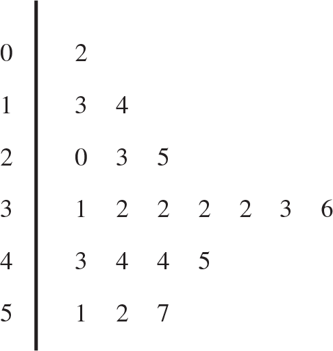
Stem and leaf plot: